indiefact app

Indiefact is a startup focused on providing consumers with valuable information through a microblogging platform. In this project, we set out to rethink the user experience of the Indiefact app and redesign the user interface to better align with the vision of the company and the needs of the consumers.

Timeline - 6 months

Platform - iOS & Android

My Role - Lead Product Designer

Problem

Indiefact was developed without a designer. Users had problems with the general experience of the app. The core problems included cluttered interface, lack of engagement and inconsistency in design patterns and elements.

Lack of engagement

Cluttered Interface

Design Inconsistency

product image

Indiefact's old interface

Goals

Enhance The Product's Main Features

We want to redesign the features the users spend the most time on which would lead to a higher retention rate. We also want to eliminate the features with poor adoption.

Creating A More Personalised Experience

We aim to increase the engagement of the app by crafting more tailored experiences and pushing more personalised content to users.We want to display content based on user's past behaviours and interests.

Consistent design and Improved User Experience

Creating a design system to ensure a consistent user experience across the app.

Impact

The metrics below were gotten months after launch to assess the overall impact of the redesign. The metrics indicate the redesign was a success.

56%

more time spent on the app

62%

increase in user engagement with posts

+44

more communities created

+19

content creators onboarded

Users

The wide pool of users was narrowed into two distinct user groups along with their various goals. The personas created informed the features to prioritise going forward.

user image

Active User

She/he loves to stay on top of recent happenings, visits a lot of news websites a day and belongs to social circles where they share information. This type of user is easily onboarded by Indiefact.

Their goals include being able to get accurate information on the go and verifying if an information is accurate.

Setback: The app feels like a news site instead of a social platform to engage in conversations.

Passive User

She/he does not go out looking for information but would consume and engage if they happen to come across it.

Their goals include being able to get relevant information without a lot of effort.

Setback: The content displayed is not tailored to their interests.

user image

Information Architecture

The majority of the user flows on the app remained the same except for a few which changed. We instead opted for an information architecture diagram to get a holistic view of the features the app has and their dependencies.

information architecture

Early Designs

The designs went through several iterations before arriving at the final designs. The reason for this was to improve the customer experience and align with business interests.

User Testing

We conducted a moderated usability testing with 15+ participants. These tests were conducted remotely and via Zoom. The users were given tasks and asked to think aloud as they completed the tasks.

The test gave insights into where the designs worked and what needed improvements.

Final Designs

After some more iterations, the designs were finalized. The finalized designs are shown below.

Style Guide

A style guide was designed for Indiefact to help with consistency across the app.

The style guide contains fonts, colors, components, icons and several elements used throughout the app.

The style guide contains elements for both light mode and dark mode.

Improved Homepage

The leaderboard stands out from the rest of the page. The post card has been reorganised based on priorities.

The feed is personalised to the interest of the user and the post-reaction icons are more interactive.

Combining Search and Trending

The search page was combined with the trending page to add more functionality to the search page.

Making Communities More Discoverable

Changed the visuals of creating communities from a button to a card so users are more likely to tap it.The community cards are smaller so users can scroll through communities faster.

Improved Create Post Flow

The tags are now displayed all at once so users don’t think it’s an infinite scroll.

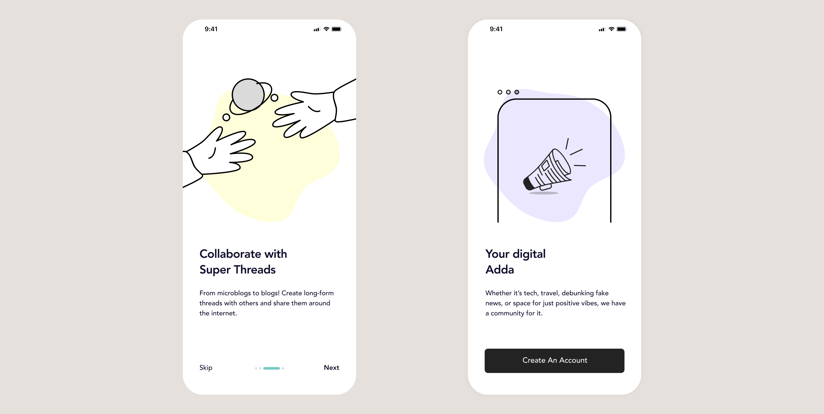
Improved Onboarding

I designed a better onboarding experience to successfully onboard users to the app.

Takeaway

Users' Feedback Is A Very Valuable Resource

Helpful feedback from users can lead to the creation of better products that meet their needs.

Better collaboration With Developers

Building great products means seeing through developers' eyes while thoughtfully matching team talents to timeline commitments.

I want to thank all those I worked with at Indiefact, they added immense value to my experience as a product designer.

Other Projects

Bartazar Image

Case Study

Bartazar Webapp

Bartazar is a commerce platform that makes it easier for users to swap items (digital/physical) at a fair market price.

UI Resource ImageIndiefact

UI Resource

UI resource is a hub for accessing a wide range of tools, templates, and design assets for designers and developers.